
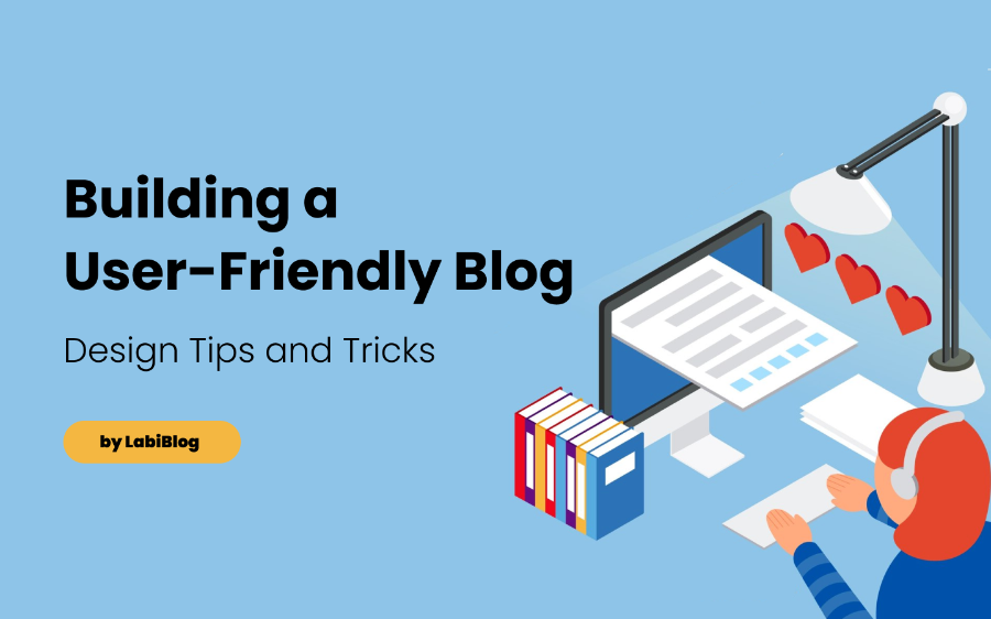
A well-designed, user-friendly blog keeps visitors engaged and converts readers into followers and customers. Optimizing your site's look, layout, speed, and responsiveness enhances user experience and satisfaction.
With LabiBlog, customizing your blog's design is simple yet powerful. Let's look at the significance of user-friendly design, how to leverage LabiBlog's customization capabilities, and tips for improving your blog's overall UX. Follow these tricks to make your blog shine.
The Importance of User-Friendly Design
In the digital world, first impressions matter tremendously. Within milliseconds of visiting your blog, readers will form an opinion regarding its quality, professionalism, and appeal.
A cluttered, slow, or confusing site will immediately turn visitors away. But a clean, intuitive, visually pleasing design makes a strong positive impression. This helps build trust and credibility. Users are far more likely to deeply engage with your content, follow your blog, and convert to customers.
Consider these user experience factors:
✅ Site speed - Faster sites perform better on mobile and rank higher in search. Avoid anything slowing things down.
✅ Mobile friendliness - Most traffic is now mobile. Optimize for smaller screens with responsive design.
✅ Scannability - Break up text with headers, images, lists, highlights. Make it easy to scan.
✅ Consistent layout - Keep navigation and design elements in set locations across all pages.
✅ Simple workflows - Remove unnecessary steps from registration forms, checkouts, etc. Streamline processes.
✅ Intuitive navigation - Link site sections logically and prominently. Include search bars and site maps.
✅ Readability - Use ample whitespace, sufficient text sizing, dark text on light background, and pleasing fonts.
✅ Visual appeal - Employ appealing color schemes, balanced layouts, engaging graphics, and strong imagery.
Any small improvements you can make to the user experience add up. Treat your blog design and performance optimization as an ongoing process, not a one-time task. Let's look at customizing your LabiBlog.
Customizing Your LabiBlog Design
✅ Color schemes - Set your brand colors, change background shades, button colors, text colors, and more.
✅ Typography - Choose complimentary font combinations from an extensive font library for headlines, body text, etc.
✅ Page layouts - Select sidebar position, content width, widget locations, footer content, and other structural elements.
✅ Menus - Set main navigation menus and footers menus with drag-and-drop management.
✅ Widgets - Embed useful widgets like search bars, social sharing buttons, calendars, recent posts, etc.
✅ Header style - Upload logos, set taglines, stylize headers with images, overlays, etc.
✅ Blog feed layout - Determine how post excerpts are styled and paginated on the blog main page.
✅ Individual pages - Customize elements on key pages like "About" and "Contact" pages.
✅ Media galleries - Set styles for image and video galleries shown across posts and pages.
Start by defining your target audience and your brand style guidelines. What colors, fonts, and visual aesthetic best fits your industry and personality?
You don't need design experience. LabiBlog makes it easy to experiment with different options and see changes in real-time. The key is finding a style that brings out your brand while enhancing UX.
Tips for Improving User Experience
👉 Create visual hierarchy - Use headline styles, text styling, and spacing to establish a clear visual hierarchy. Draw attention to what's most important.
👉 Chunk content - Break long form posts into smaller paragraphs with subheadings and lists. Don't overload readers with dense text.
👉 Use whitespace - Don't overcrowd the page. Liberal use of margins and breathing room improves scannability.
👉 Write scannable content - Short sentences, simple language, an easy-to-digest writing style. Optimized for online consumption.
👉 Highlight key points - Bold key terms and phrases. Use bullet points and numbered lists to call out takeaways.
👉 Use descriptive headers - Headers should clearly summarize sections. This provides a content outline for skimming.
👉 Include graphics - Relevant images, illustrations, charts, videos, and GIFs make posts more engaging.
👉 Link to related content - Recommending relevant older posts keeps readers on site. Links provide context.
👉 Consistent navigation - Primary menus should appear identically across all pages. Don't change item order.
👉 Prominent calls-to-action - Bright buttons encourage email sign ups, downloads, purchases, and other desired actions.
👉 Social sharing - Enable one-click sharing to Facebook, Twitter, LinkedIn, Pinterest etc. Make going viral easy.
👉 Commenting - Reader discussions build community. Make signing up easy via social login. Moderate when needed.
👉 Email subscription - Offer numerous opt-ins for your newsletter. Email nurturing converts readers.
👉 FAQ page - Answering common questions builds trust. Proactively head off concerns.
👉 Search function - A site search helps visitors instantly find what they need. Less hunting means less bounces.
👉 Site map page - A page showing your site structure helps visitors navigate efficiently. Link in footers.
👉 404 error page - Customize the page visitors see when a broken link is clicked. Add links guiding them back to the site.
👉 Contact page - An easy way for visitors to get in touch, ask questions, or voice feedback. Personal touch builds loyalty.
Continuously look at your blog pages from a visitor's perspective. Identify any sticking points impeding their experience. Smoothing out workflows and interactions optimizes conversions over time.
Mobile Responsiveness and Speed
Two final aspects that significantly influence user experience are site speed and mobile optimization. With over 60% of traffic now from smartphones, a mobile-friendly responsive site is essential. Content should dynamically resize and rearrange itself for optimum viewing on any device.
LabiBlog makes achieving mobile responsiveness easy. Just choose one of the many responsive theme templates when first customizing your blog. You also want blazing fast performance. Faster sites have higher visitor engagement, lower bounce rates, and better search rankings. Test your blog's speed with Google PageSpeed Insights and GTmetrix.
Enable browser caching, compress images, minimize plugins, and optimize code to improve speed. Find the right balance between performance and the functionality provided by various visual design elements. LabiBlog boasts a suite of built-in capabilities to cater to these needs.
An aesthetically pleasing, fast-loading, and intuitive user experience keeps visitors actively engaged with your content. Leverage LabiBlog's powerful yet user-friendly customization capabilities to ensure your blog aligns with your brand and appeals to your target readership.
Continually refine design elements, writing style, site navigation, page layouts, visual hierarchy, calls-to-action, and mobile responsiveness. Treat UX optimization as an evolving process, not a one-time task. A stellar user experience across your blog will pay dividends through more traffic, leads, and sales.
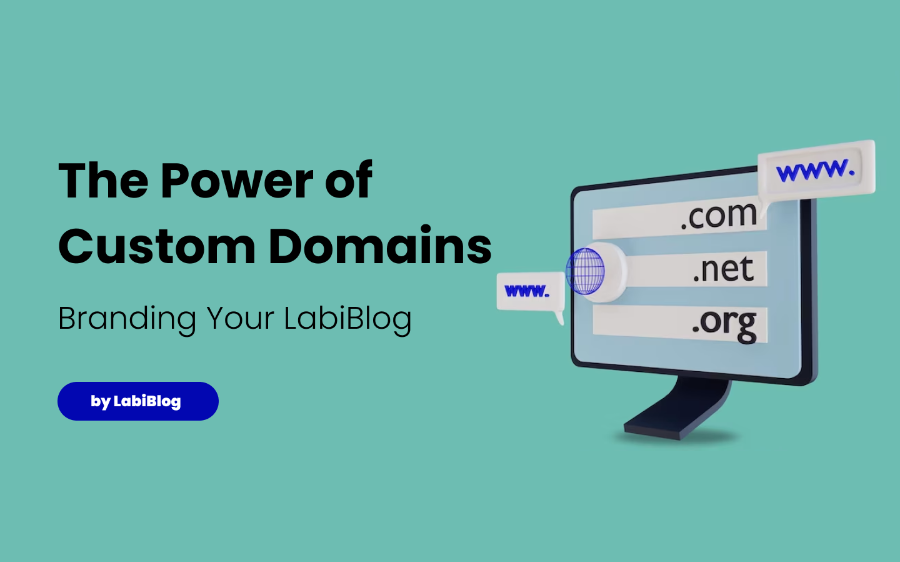
Greetings👋 ! Appreciate your time reading this. Don't miss out on other LabiBlog Blog Team pieces on Content Marketing, Blogging, SEO and more, like: The Power of Custom Domains: Branding Your LabiBlog!
